In this way i attempted to cause people to reconsider the interrelationships between a gallery and apartment and their similarities and differences in terms of privacy, display and viewing.


 above - some moments of contrast in the scheme
above - some moments of contrast in the scheme
above - some moments of contrast in the scheme


 The change the the appearance and feel of the model was quite dramatic from 1:200 to 1:100


 Sphinx, 2009
 Concept Model 1
 Concept Model 2
 This shows the 'polluted' room, uninhabitable
 The Openings/light shift and reveal the program. I imagined the plaster shape to the right as a private outdoor room, the left wall is louver-like windows, which move outwards to offer a bookcase internally. The back wall opening moves inwards to create a table, making a new opening in the wall.

 The central stairs lead to an upper library level hosued in the resin block.

 Trial embedding objects in resin
 Cutting Ascetate walls
 Making moulds for plaster and resin casts
 Structure - This diagram was the most straight forward, Villa Muller has thick structural outer walls and four main columns
 Geometry – At first look geometry wasn’t too obvious within Villa Muller, I don’t think it was an overriding concern. I focused on the shifting geometry of the room volumes in section and the general orthogonal nature of the plan.
  Program – Loos believed that each room, having a different function purpose should have a different height and shape to accommodate that function. In drawing out a series of important rooms in section with their plan underneath I was hoping to demonstrate the varying shapes and sizes of the rooms. The inclusion of detail was to convey how meticulously Loos planned each room to suit its program.
 Circulation – The circulation in Villa Muller is rather complex and there is no clear level rather a series of connected spaces. I overlaid the stairs and doors of every plan to try and convey this complex system. Circulation in section reveals the lack of levels and also makes evident the contrast between the rapidly ascending staircase intended for servant use and the more gradual rise of the stairs for the owners of the Villa.
 Enclosure – Loos stated that "The building should be dumb outside and only reveal wealth inside." This is most evident as the somewhat sterile nature of the exterior appears completely removed from the warm and luxurious inside. My diagram aimed to show this in entirely removing the internal plan from the heavy exterior walls.


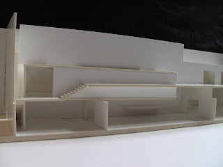
 Section Cut – We decided to remove just the West wall of the villa for the section cut as this keeps the model mostly intact, like the large, heavy cube like structure that the building is. In peeling back this wall all the essential features of Loos design are evident with the different height spaces connected and related to each other not in a series of levels.
 Modelling materials – more apparent in this photo is the watercolour paper we decided to use to contrast the white card used for the exterior of the building. This was to demonstrate the detachment between exterior and interior. The texture and slight cream colour of the watercolour also helps to convey the rich nature of Loos interiors.


